
DESCRIPTION
This method is stepping into one of the most powerful and timeless composition techniques in visual storytelling: the Golden Cut (also called the Golden Ratio or Φ ≈ 1.618) to guide how text, visuals, and key elements are positioned on a slide.
Below you’ll find a complete explanation of how to apply the Golden Cut to slide decks without needing to be a designer. It’s a proportional system derived from nature, mathematics, and classical art and describes a visually pleasing division of space where the ratio of the smaller part to the larger part equals the ratio of the larger part to the whole creating a perfect balanced and proportioned layout.
In storytelling and slide design, this ratio helps position key content in places where the human eye instinctively feels balance, harmony, and clarity.
The result: slides that are not only more beautiful, but also more digestible, focused, and emotionally engaging, because they mirror natural visual rhythm.
ORIGIN
Coming from photographie, it’s has found it’s way to any kind of marketing and communication setup since the 60-70’s and even on film posters frome the beginning of the 1900’s.
Approximately needed time
- Method 1: 1 hour
- Method 2: 2-3 hours
- Method 3: 1-2 hours
- TOTAL: 4-6 hours
- Training: 2-3 hours
METHOD
MATERIAL YOU COULD NEED: list
STAKEHOLDER GOOD TO KNOW: list
METHOD
one
0%THE GOLDEN GRID LAYOUT (for text and image composition)
Target: Divide your slide into areas following the 1:1.618 proportion to guide placement of content in predefined blocks.
Divide your slide width and height using the golden ratio: Horizontally: 100% → 62% (main area) → 38% (secondary area). Vertically: 100% → 62% (main zone) → 38% (supporting zone). or just download and use the pciture below…
The intersection of these lines (around upper-right or lower-left) forms the Golden Point, the natural focus zone. Place your most important visual or keyword at or near this intersection. Keep secondary content (logos, footnotes, data) in the smaller area. creating tension and direction.
Example: Image of a mountain landscape takes 1/3 of the left side. Quote or headline sits near the golden intersection on the right. This causes (forces) the eye to travel naturally from wide context (image) to key insight (text).
In PowerPoint or Keynote, use guides or rectangles to measure these proportions. Once you have one “golden grid,” duplicate it as a layout template.
two
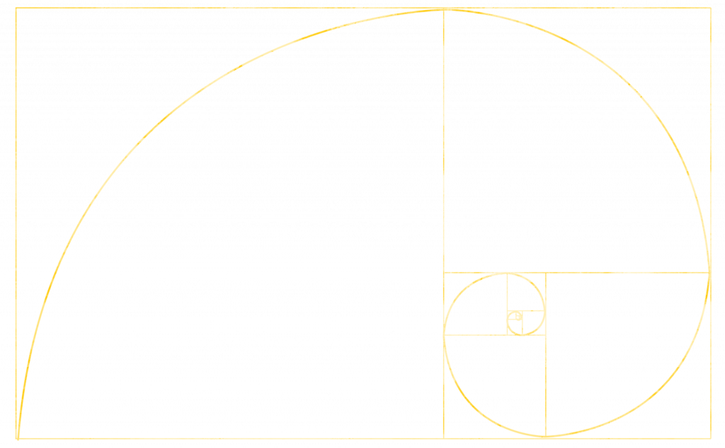
0%THE GOLDEN SPIRAL (for visual storytelling slides)
Now, lead the viewer’s eye along a natural visual journey, spiraling toward the story’s key point.
Overlay a Golden Spiral (can be downloaded as transparent picture below or drawn via guides). Align the story’s “flow” with the curve — the spiral’s center marks your storytelling climax. Arrange visuals (or data) to follow that curve:
Start of story on the top-left. The middle part (for development) goes diagonal through center and the (final) punchline or insight is placed at the bottom-right spiral center
Example: A slide telling a product evolution story:
- Start: old product image (top-left).
- Development: stages of innovation along the spiral.
- End: final product at spiral center, highlighted and bright.
Effect: The audience’s eyes are gently guided through the story path with no confusion but full engagement.
Search “Golden Spiral overlay” in Google (or the picture below) and import it temporarily into your slide deck for positioning and remove it when you’re done.
three
0%THE GOLDEN TYPOGRAPHY (for heavy text slides)
Use golden ratio proportions to size and space text elements for clarity and hierarchy. Choose your base font size (e.g., 16 pt for body text). Multiply or divide by the Golden Ratio to find harmonious text scales:
- Headline: 16 × 1.618 ≈ 26 pt
- Subheadline: 26 ÷ 1.618 ≈ 16 pt
- Notes: 16 ÷ 1.618 ≈ 10 pt
Apply the same ratio to line spacing, margins, and padding.
Keep blocks aligned within your golden grid (from Method 1).
The text feels proportional, clean, and elegant without manual fiddling.
Once you establish your type scale, save it as a “slide master” template for automatic consistency across decks.
PROS
0%Natural attention flow: The human eye tends to land on the “golden point” of a space, about 60% across and 38% down.
Visual harmony: Slides following this ratio feel intuitively “right” and not too busy, not too empty.
Story focus: Helps presenters position main messages, visuals, and data where attention naturally peaks.
Trust and credibility: Balanced proportions signal care and professionalism and people feel quality before they analyze it.
CONS
0%Visual chaos or imbalance are too top-heavy or bottom-empty.
Overcrowded center results in lost narrative structure.
Reduced readability and viewer fatigue.
Message “feels off” even when content is correct.
visual
0%Download this transparent picture, put it to your background as guide, a strat balacing your slides…
TRAIN
0%Objective: Train your eye to see and feel balance instinctively.
1) Create 3 slides:
- Slide 1: All content centered (no ratio).
- Slide 2: Random layout (chaotic).
- Slide 3: Golden Cut layout applied.
2) Ask test viewers and yourself:
- Which slide feels easiest to look at?
- Where does your eye land first?
- Which message is clearest?
You’ll notice that slide 3 (the golden cut) feels effortless and even if viewers can’t explain why. That’s the power of subconscious design harmony.